16 Dark Romantic Wedding Color Palette Ideas for Elegant Decor
Wedding planning hits you with a hundred decisions before breakfast.
One minute you’re picking a venue, the next you’re staring at paint swatches wondering if “midnight” and “espresso” are actually different colors.
Here’s the good news. A dark romantic palette gives your whole day instant direction.
Rich, moody tones photograph beautifully and feel timeless no matter your budget.
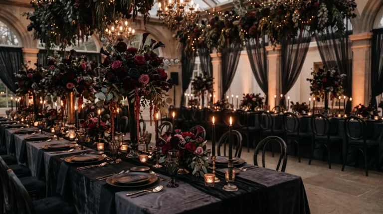
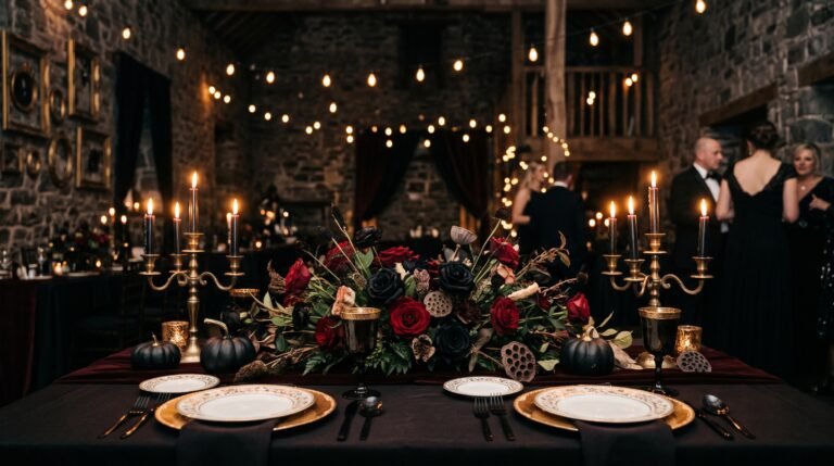
1. Black Burgundy Velvet Palette
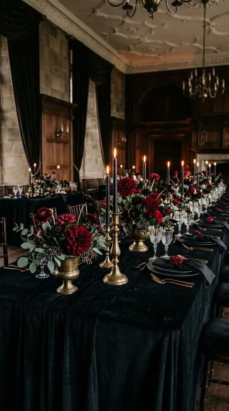
Velvet and burgundy together create instant old world glamour.
This palette works for candlelit ballrooms and rustic barns alike.
Black taper candles paired with deep burgundy linens set a dramatic tone. Add a few brass candlesticks for warmth against the darker shades.
For flowers, lean into garnet dahlias and near black scabiosa. They add texture without fighting the velvet’s richness.
A quick tip: order swatches before committing to linen rentals. Velvet reads darker under warm lighting than it does in daylight photos.
Brides who choose this combo tend to love a little drama, and honestly, good for them.
Hey there! Some links on this page may be affiliate links which means that, if you choose to make a purchase, I may earn a small commission at no extra cost to you.
2. Plum And Antique Gold
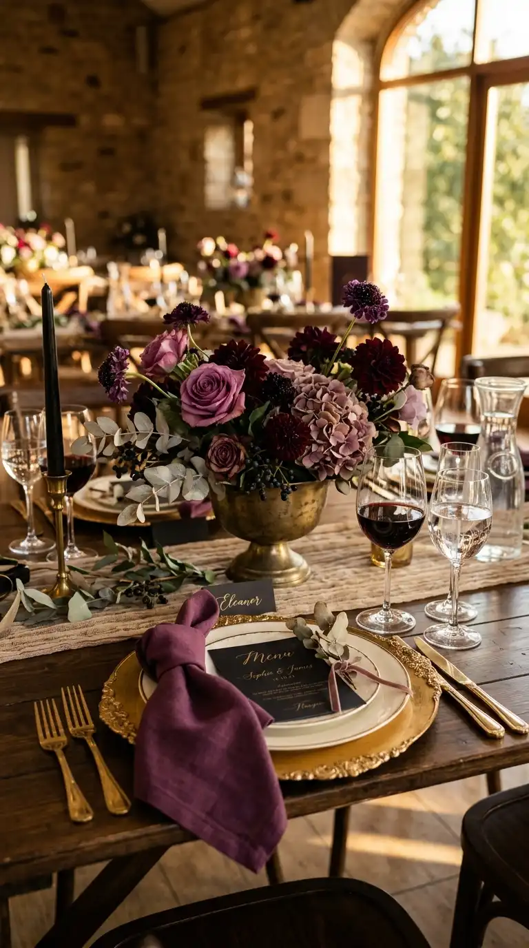
Plum brings softness that pure black sometimes lacks.
Pair it with antique gold for a palette that feels warm rather than heavy.
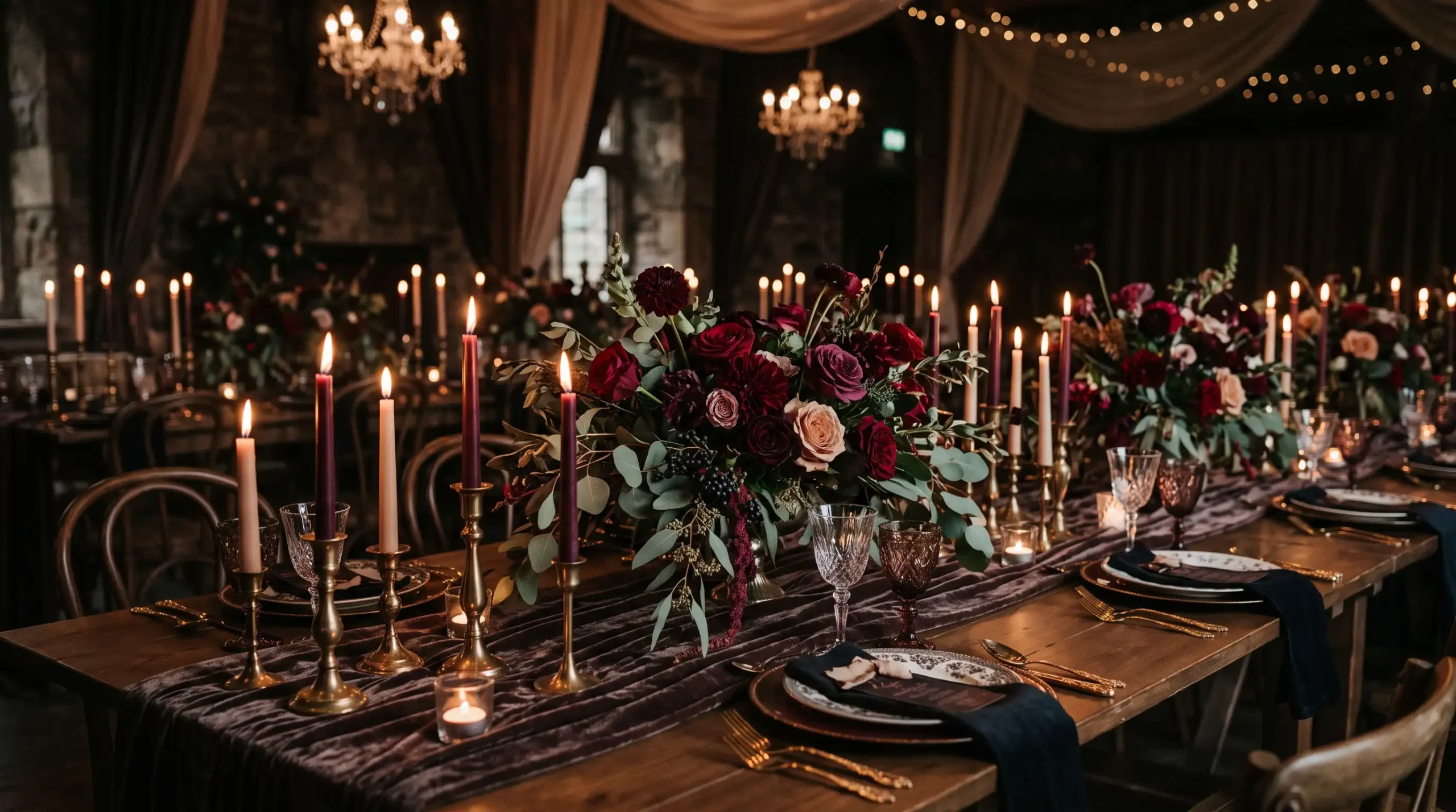
Try gold charger plates under plum napkins for an easy tablescape upgrade. Thrifted brass candle holders work just as well as new ones.
Florals in aubergine and mauve tones keep the look cohesive. A few sprigs of eucalyptus soften the overall palette.
This combination photographs gorgeously at golden hour. The gold picks up sunset light in a way that feels almost cinematic.
Budget tip: spray paint thrifted frames in antique gold for signage. Nobody will guess they cost three dollars each.
3. Chocolate Brown Wine Red
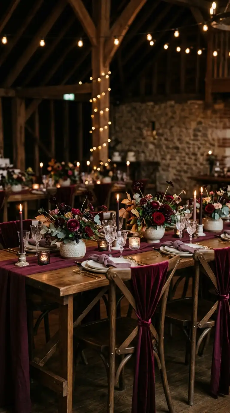
Chocolate brown grounds this palette in something cozy and grown up.
Wine red adds just enough richness to keep things romantic.
Think exposed wood tables paired with wine colored velvet chair sashes. The contrast feels intentional without trying too hard.
Bridesmaid dresses in wine red look stunning against brown suits or tuxedos. It’s a combination that reads elegant in every single photo.
For florals, chocolate cosmos are an underrated pick here. Their deep maroon petals almost match the actual flower’s namesake scent.
This palette suits fall weddings especially well, though nothing says you can’t use it in June.
4. Emerald Green Black Palette
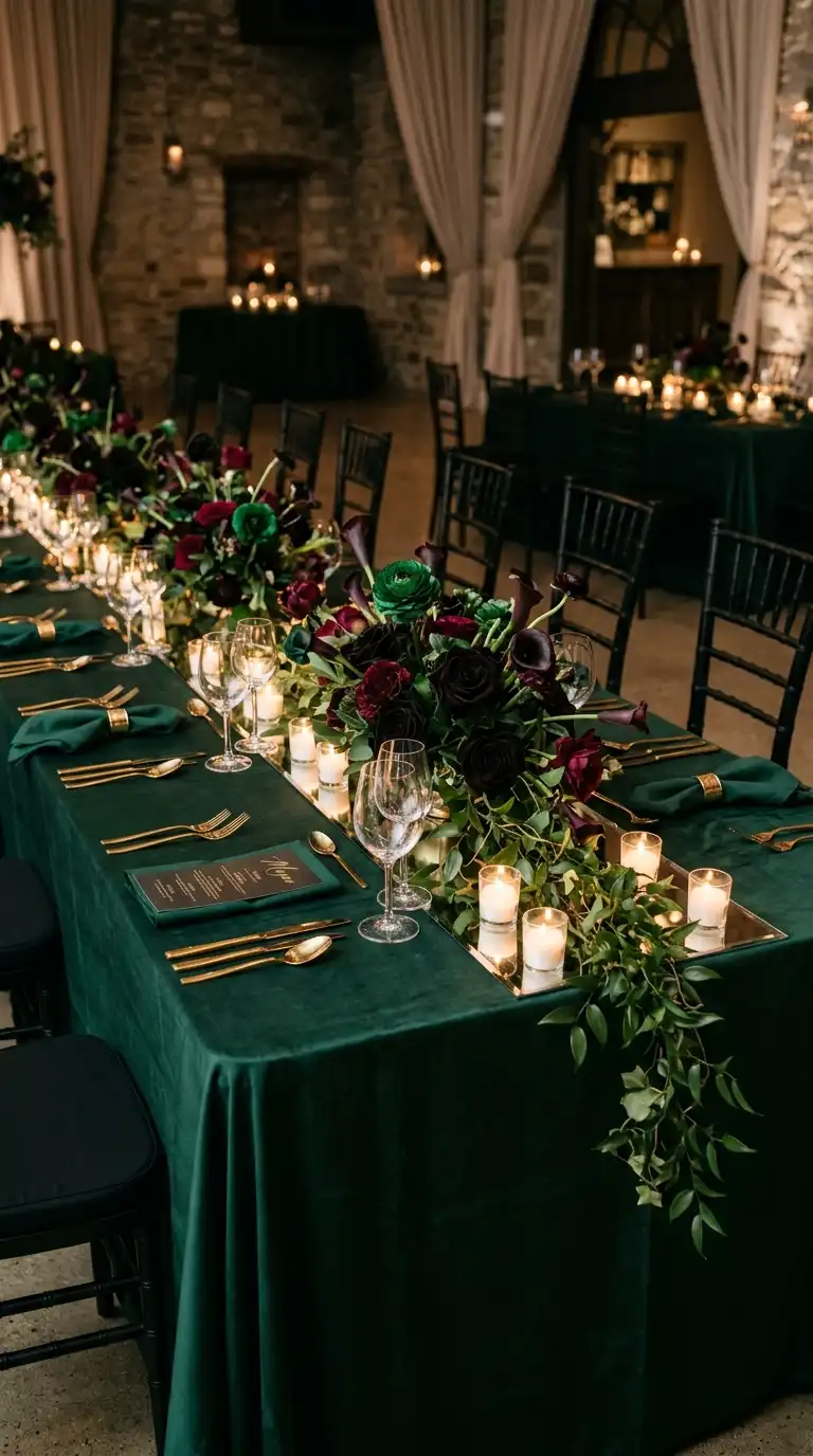
Emerald green next to black feels lush and a little theatrical.
It’s a favorite for couples who want drama without going full gothic.
Deep green linens against black chairs create striking contrast at any reception. Add gold flatware to keep the table from feeling too heavy.
For bouquets, mix emerald ranunculus with black baccara roses. Trailing greenery like smilax adds movement to bridal party florals.
One styling trick: use mirrored table runners under your centerpieces. They reflect candlelight and make the emerald tones practically glow.
This palette also translates beautifully into groomsmen attire. Emerald ties against black suits never go out of style.
5. Navy Blue Burgundy Combination
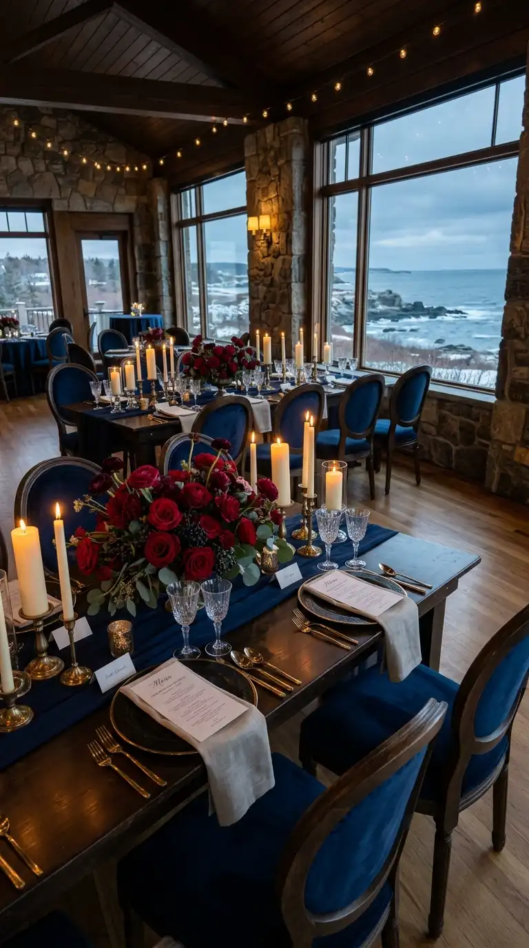
Navy and burgundy are a classic pairing for a reason.
Together they feel refined without veering into stuffy territory.
Navy linens paired with burgundy florals create a rich, layered table. Adding ivory candles keeps the whole setup from feeling too dark.
Bridesmaids in navy look striking holding burgundy bouquets. It’s an easy way to add color contrast to your wedding party photos.
Consider navy velvet dinner chairs if your venue allows rentals. They instantly upgrade the room’s whole vibe.
This combo works beautifully for winter weddings near the water. Something about navy just feels right next to a coastline in December.
6. Blackberry Purple Champagne Gold
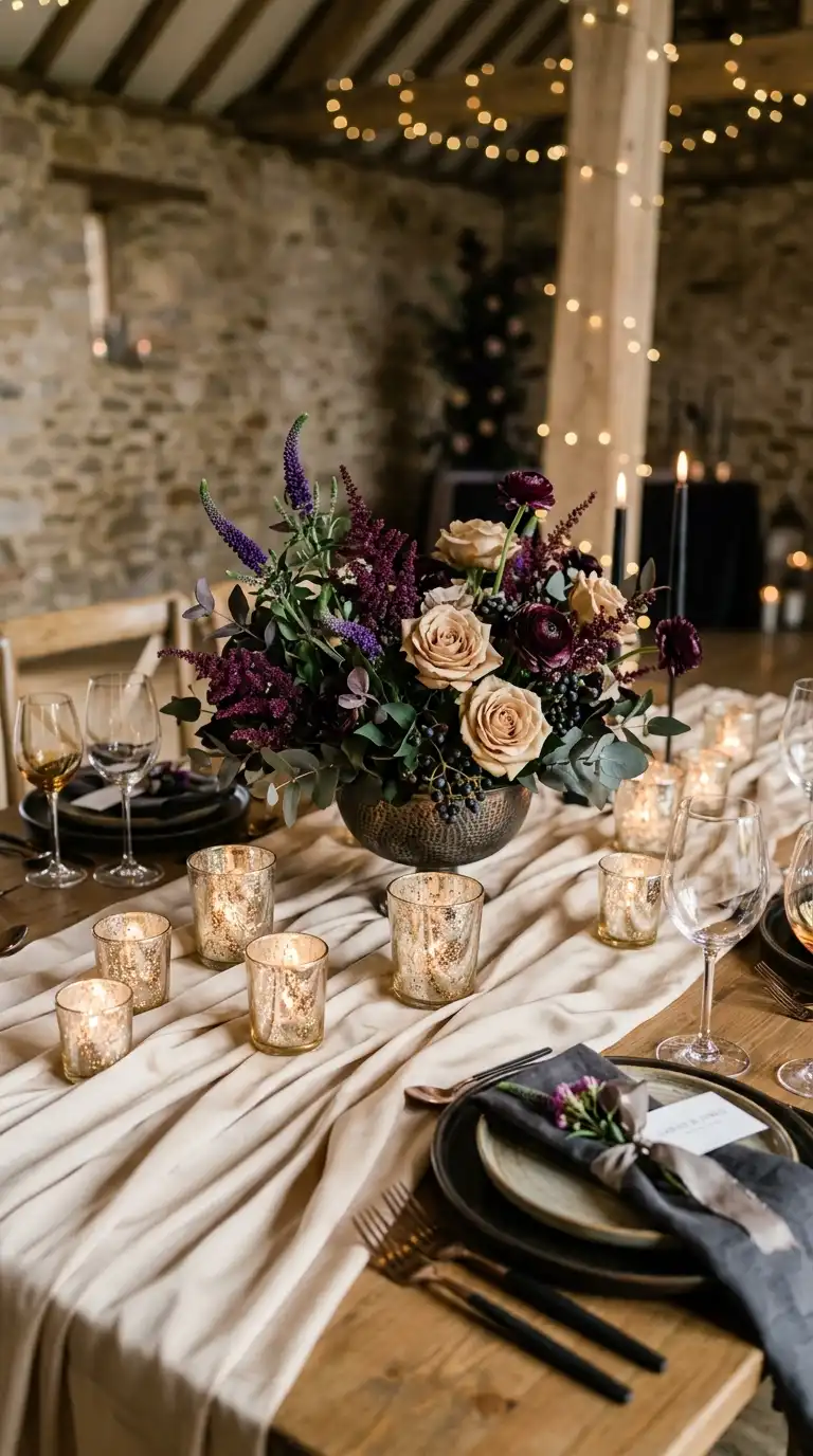
Blackberry purple has a jewel tone richness that feels genuinely romantic.
Champagne gold softens it so the palette never feels too intense.
Try blackberry colored bridesmaid dresses against champagne colored linens. The contrast keeps photos feeling bright even in a dim reception hall.
Florals in deep purple, think veronica and dark astilbe, pair beautifully with champagne roses. Together they create depth without looking muddy.
A helpful tip: use champagne mercury glass votives scattered across tables. They catch light and tie the metallic tones together effortlessly.
This palette suits couples wanting elegance with a slightly whimsical edge.
7. Deep Red Smoky Gray
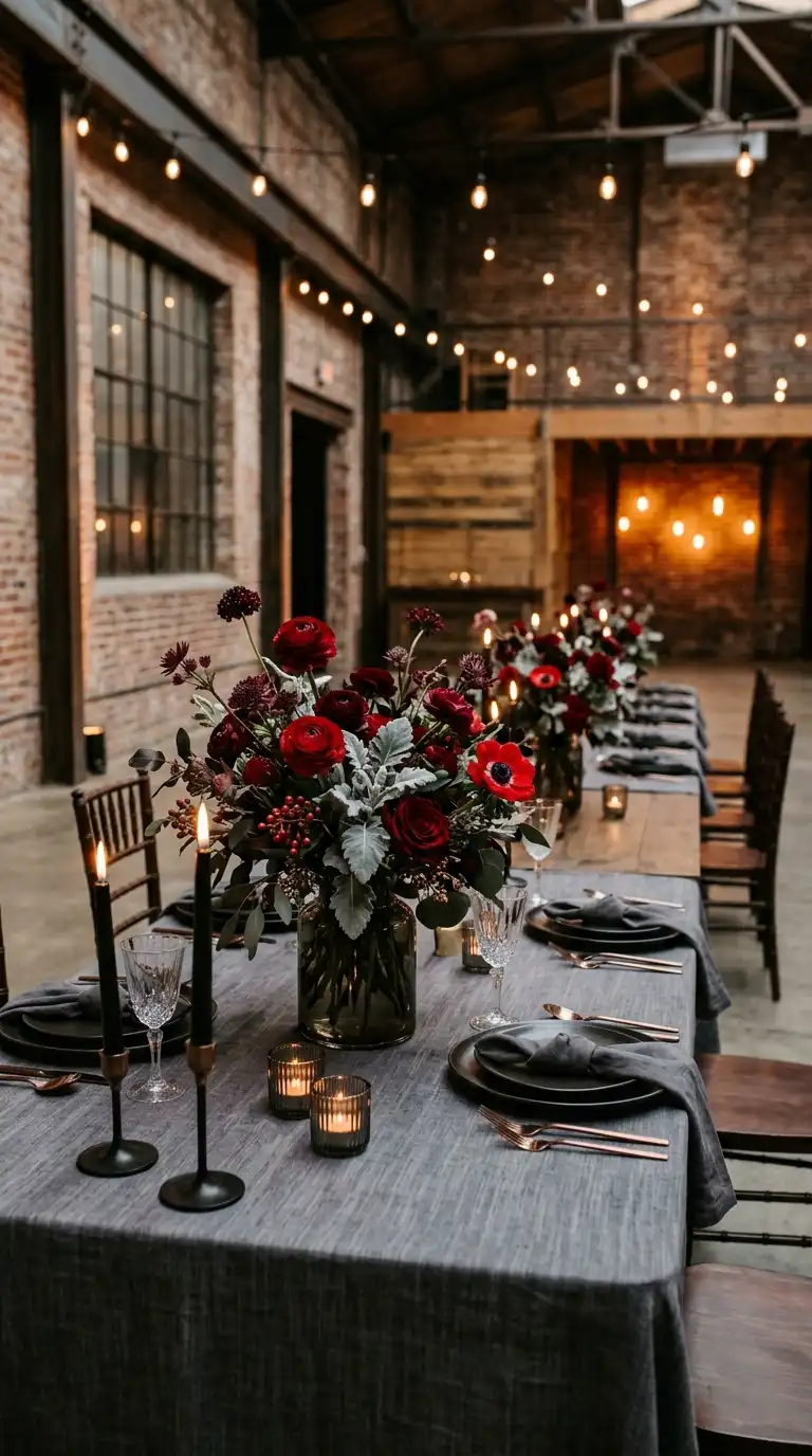
Deep red and smoky gray create a palette that feels moody and modern.
It works especially well in industrial or loft style venues.
Gray linens with deep red florals feel unexpectedly fresh. This combo avoids looking overly traditional or holiday themed.
For bouquets, mix red ranunculus with dusty miller for texture. The silvery gray foliage plays perfectly against the red tones.
Styling tip: use smoked glass vases instead of clear ones. They add subtle color even before you place a single stem inside.
This palette flatters almost every skin tone in bridal party photos, which honestly makes planning easier for everyone involved.
8. Black Plum Dusty Rose
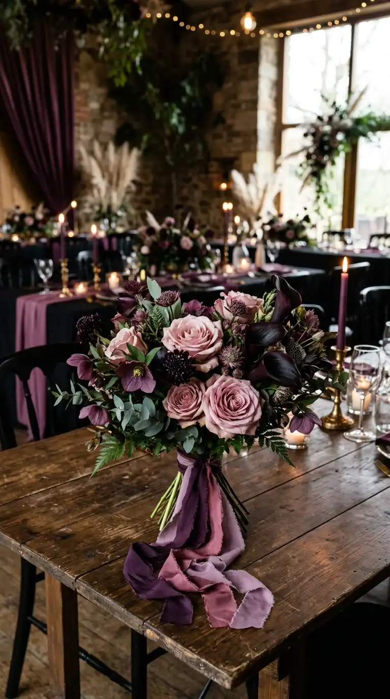
Black and plum bring the drama while dusty rose keeps things soft.
It’s a palette that feels both bold and tender at once.
Dusty rose bridesmaid dresses against a black and plum reception space create beautiful contrast. Nothing about this combination feels flat or one note.
Florals in blush, plum, and near black tones give bouquets real depth. Adding a few sprigs of dried pampas grass keeps things textural.
One tip worth trying: layer plum and dusty rose ribbon on your bouquet handle. It’s a small detail that photographs surprisingly well up close.
This palette suits couples who want romance without sacrificing edge.
9. Espresso Brown Burgundy Ivory
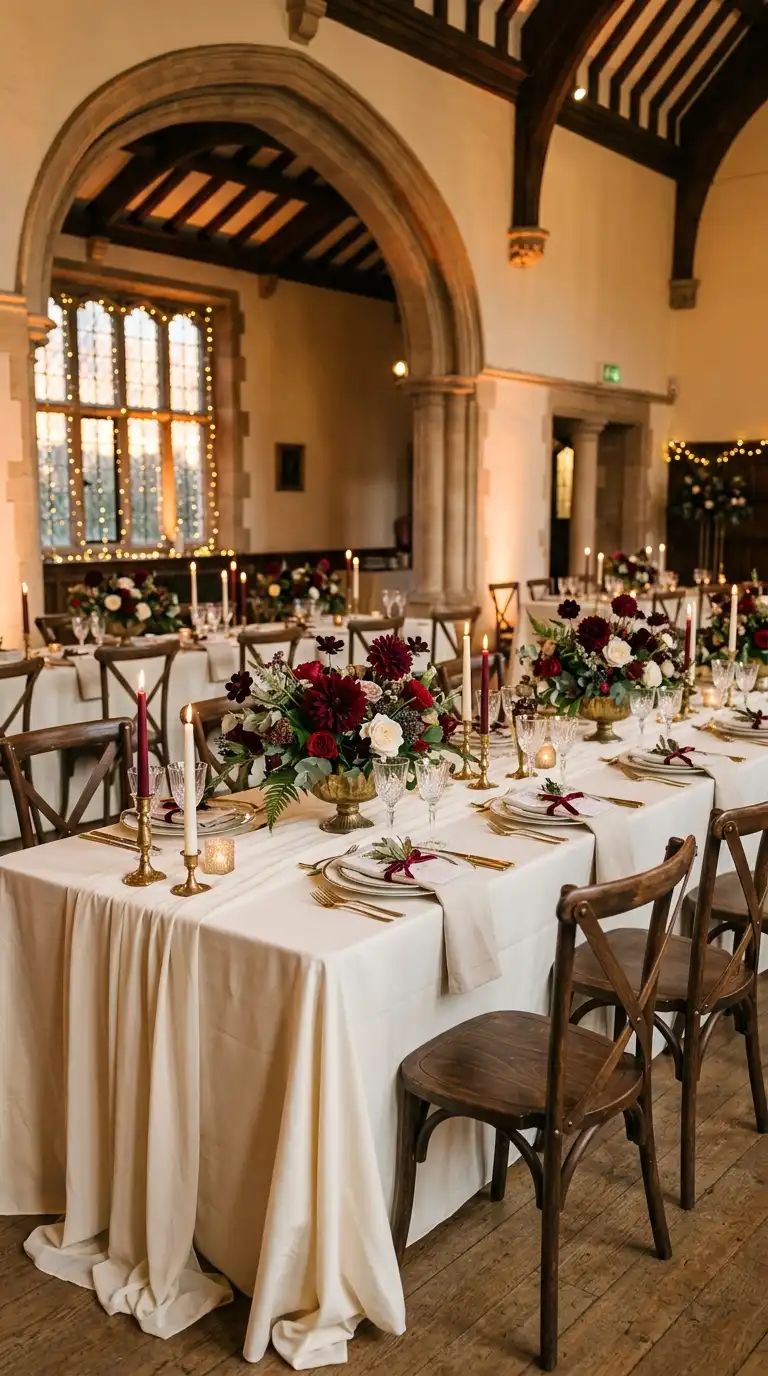
Espresso brown adds warmth that pure black palettes sometimes miss.
Paired with burgundy and ivory, it feels polished and inviting.
Ivory linens keep the darker tones from overwhelming the room. Espresso brown chairs and burgundy florals add richness without heaviness.
For centerpieces, try burgundy dahlias mixed with ivory garden roses. A few stems of chocolate cosmos tie the espresso tone in naturally.
Budget friendly tip: rent ivory linens and add color through florals and ribbon instead. It’s an easy way to control costs without sacrificing style.
This palette works beautifully for both barn venues and downtown hotel ballrooms.
10. Forest Green Black Bronze
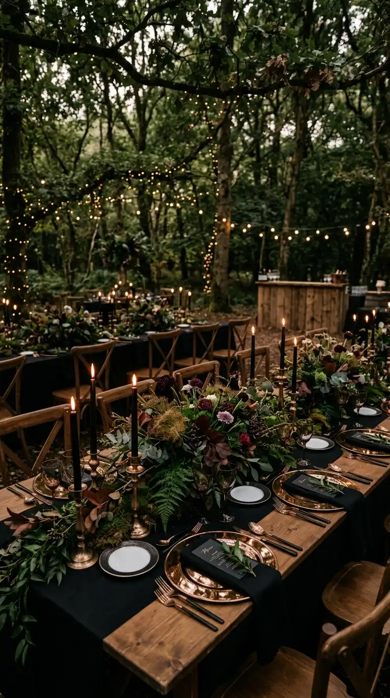
Forest green and black together feel like a walk through a moody, enchanted woods.
Bronze accents add warmth and a bit of old world charm.
Bronze candlesticks against black tablecloths and forest green florals look effortlessly elevated. This combination suits woodland or garden venues especially well.
Try incorporating bronze fennel or copper beech leaves into your florals. They bridge the green and bronze tones beautifully.
Styling tip: use bronze mirrored chargers to catch candlelight across the table. It’s a subtle upgrade that guests will absolutely notice.
This palette pairs beautifully with greenery heavy venues, so let your ceremony space do some of the work for you.
11. Wine Red Blush Pink
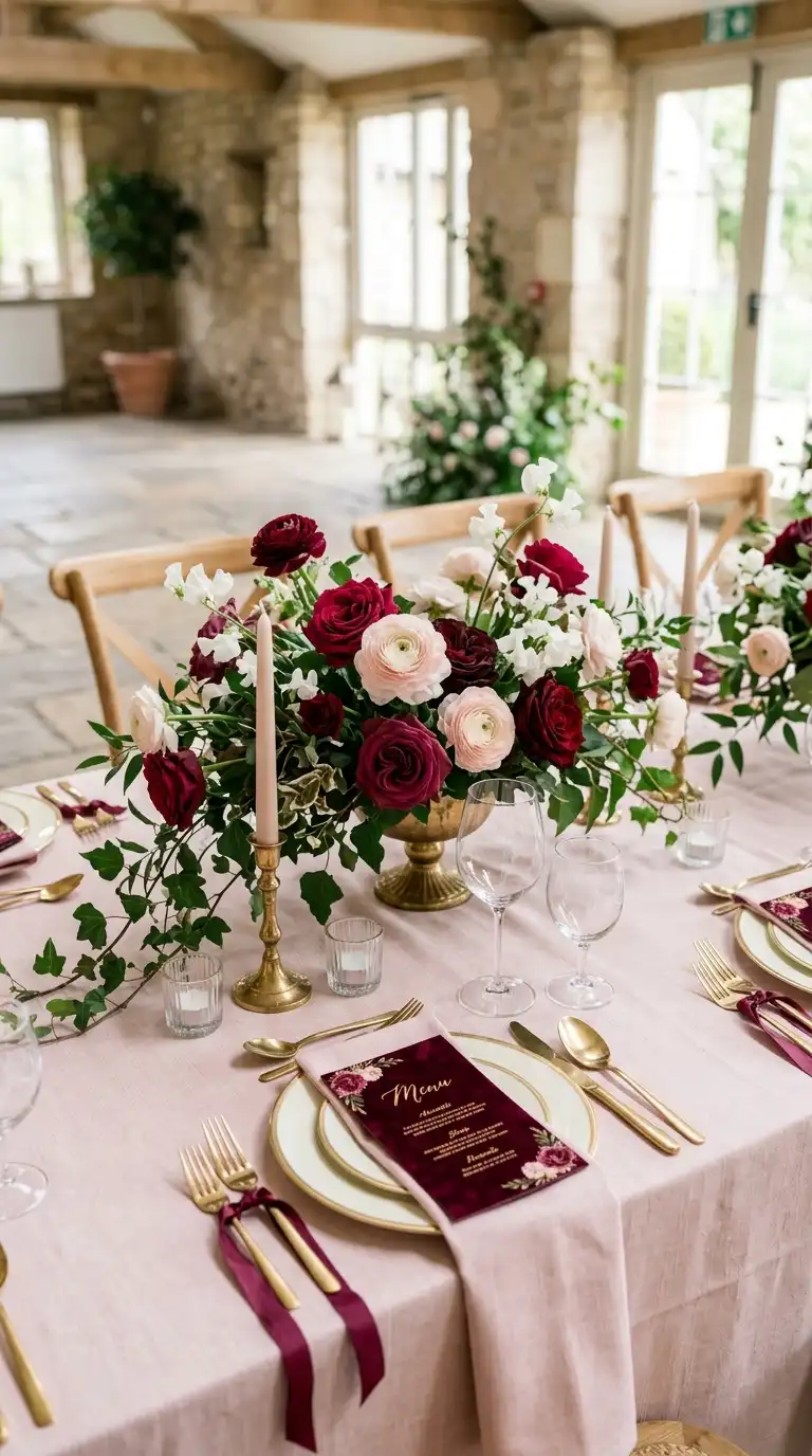
Wine red and blush pink balance boldness with softness in equal measure.
It’s a palette that feels romantic without being predictable.
Blush linens under wine red florals create a table that feels layered rather than flat. Adding gold flatware ties the whole look together.
For bouquets, mix wine colored roses with blush ranunculus and trailing greenery. The contrast between deep and soft tones photographs beautifully.
One tip: use blush ribbon on wine colored bouquets for a subtle color transition. It’s a small styling choice that makes a noticeable difference.
This combination suits both classic ballroom weddings and softer garden celebrations.
12. Midnight Blue Antique Silver
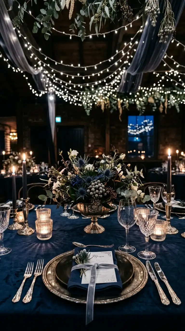
Midnight blue paired with antique silver feels cool, elegant, and a little celestial.
It’s an underrated combination for evening receptions.
Midnight blue linens with antique silver chargers create a moonlit tablescape. Adding white candles keeps the whole setup from feeling too cold.
Florals in white and silvery blue tones, like thistle or silver brunia, complement this palette well. They add texture without competing with the deep blue base.
Styling tip: hang string lights above midnight blue linens for a starry effect. It’s a simple addition that transforms the whole reception space.
This palette works wonderfully for New Year’s Eve or winter evening weddings.
13. Dark Teal Burgundy Copper
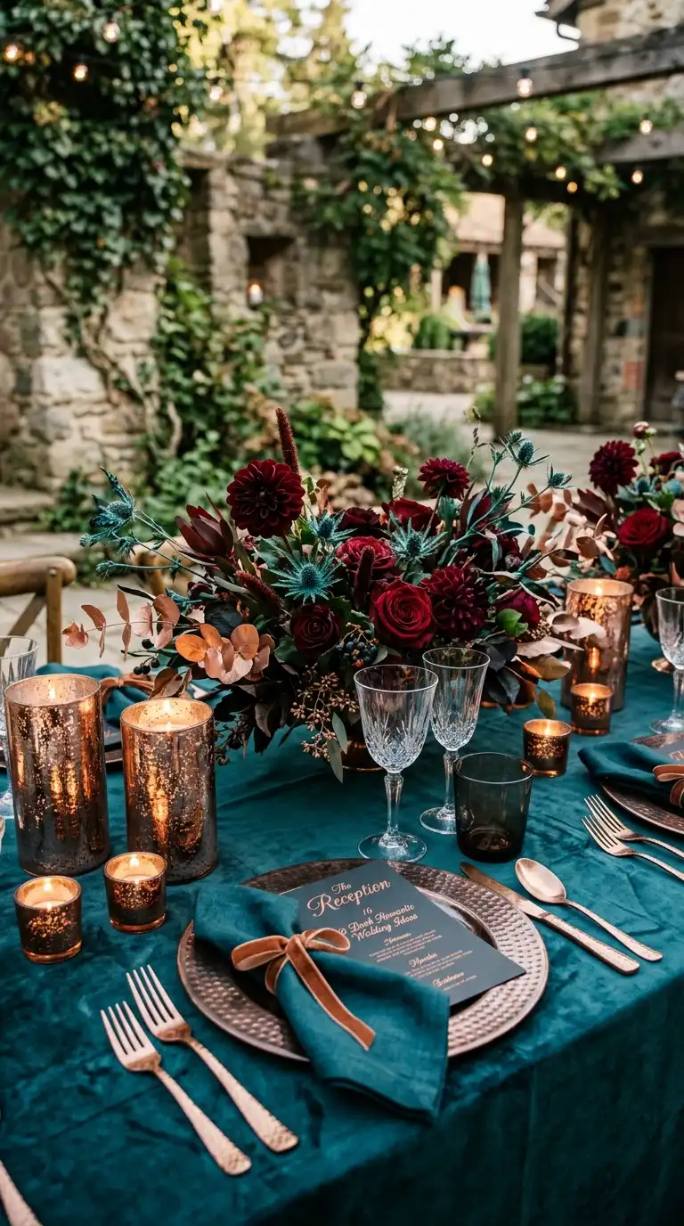
Dark teal and burgundy together create a palette that feels rich and unexpected.
Copper accents add warmth and a touch of shine.
Copper flatware against teal linens and burgundy florals looks genuinely striking. This combination avoids feeling like a typical fall palette.
For centerpieces, mix burgundy dahlias with teal thistle and copper eucalyptus. The three tones balance each other beautifully.
Tip worth trying: use copper mercury glass candle holders scattered along the table. They catch candlelight and unify the whole color story.
This palette suits couples who want something a little unconventional and memorable.
14. Black Raspberry Soft Mauve
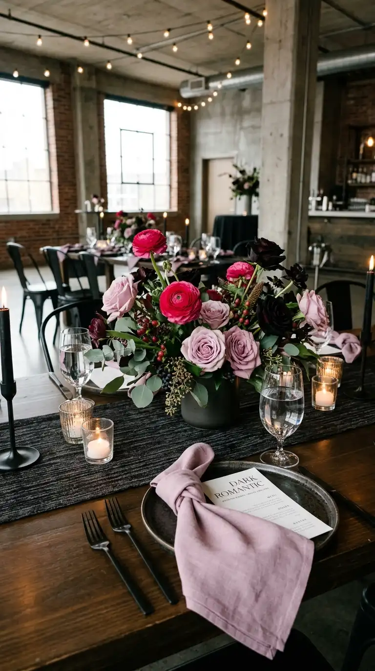
Black and raspberry bring energy while soft mauve keeps things gentle.
Together they create a palette with real personality.
Mauve bridesmaid dresses against raspberry and black florals feel fresh and current. This combination works particularly well for spring or early summer weddings.
Try mixing raspberry ranunculus with mauve garden roses in your bouquets. A few black baccara roses add depth without overwhelming the softer tones.
Styling tip: use mauve napkins with black flatware for subtle contrast. It’s an easy way to keep tablescapes from feeling too matchy.
This palette flatters nearly every venue style, from garden estates to modern lofts.
15. Aubergine Brown Cream Palette
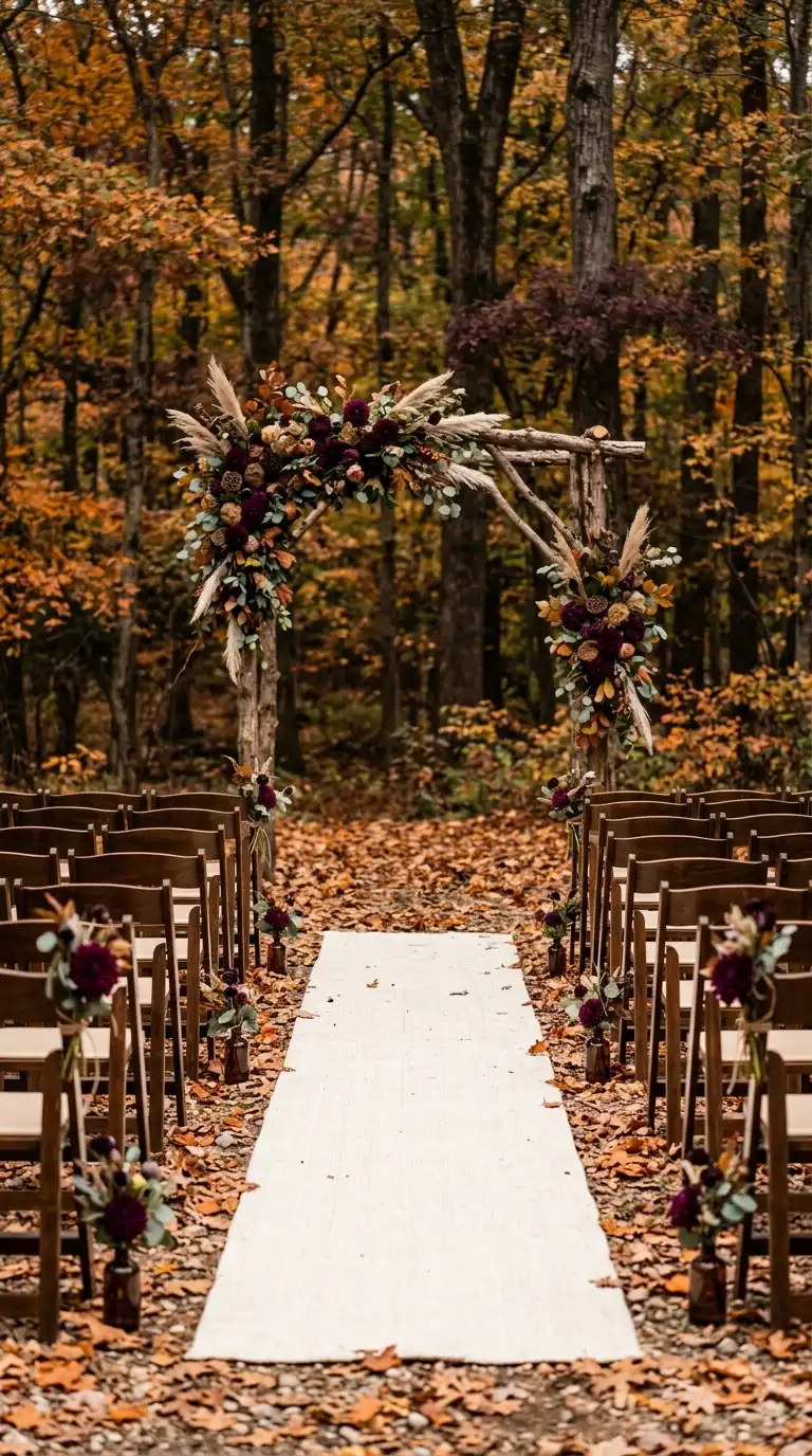
Aubergine and brown create a grounded, earthy foundation for this palette.
Cream keeps everything feeling light and airy despite the deeper tones.
Cream linens with aubergine florals and brown wood details feel warm and inviting. This combination suits fall weddings especially well.
For bouquets, mix aubergine dahlias with cream garden roses and brown scabiosa pods. The texture variation keeps things visually interesting.
Budget tip: use cream linens as your base and add aubergine through florals only. It’s a cost effective way to bring in the darker tones without full linen rentals.
This palette works beautifully for outdoor autumn ceremonies with natural wood elements.
16. Burgundy Plum Metallic Gold
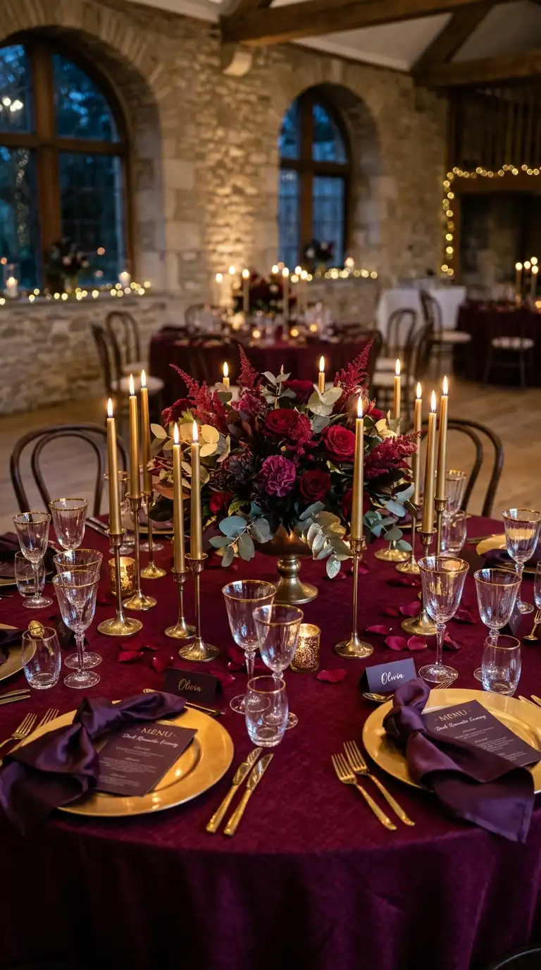
Burgundy and plum together bring serious jewel tone richness.
Metallic gold ties everything together with a bit of shine.
Gold chargers against burgundy linens and plum florals create an elevated, editorial tablescape. This palette photographs beautifully in both daylight and candlelight.
Try mixing burgundy garden roses with plum astilbe and gold painted eucalyptus. It’s a combination that feels luxurious without needing an enormous budget.
Styling tip: add gold taper candles at varying heights down your tables. The height variation alone makes the whole setup feel more dynamic.
This palette works for couples who want their reception to feel like a genuine moment, not just a party.